By Chloe Yang and Dr. Robert Sege
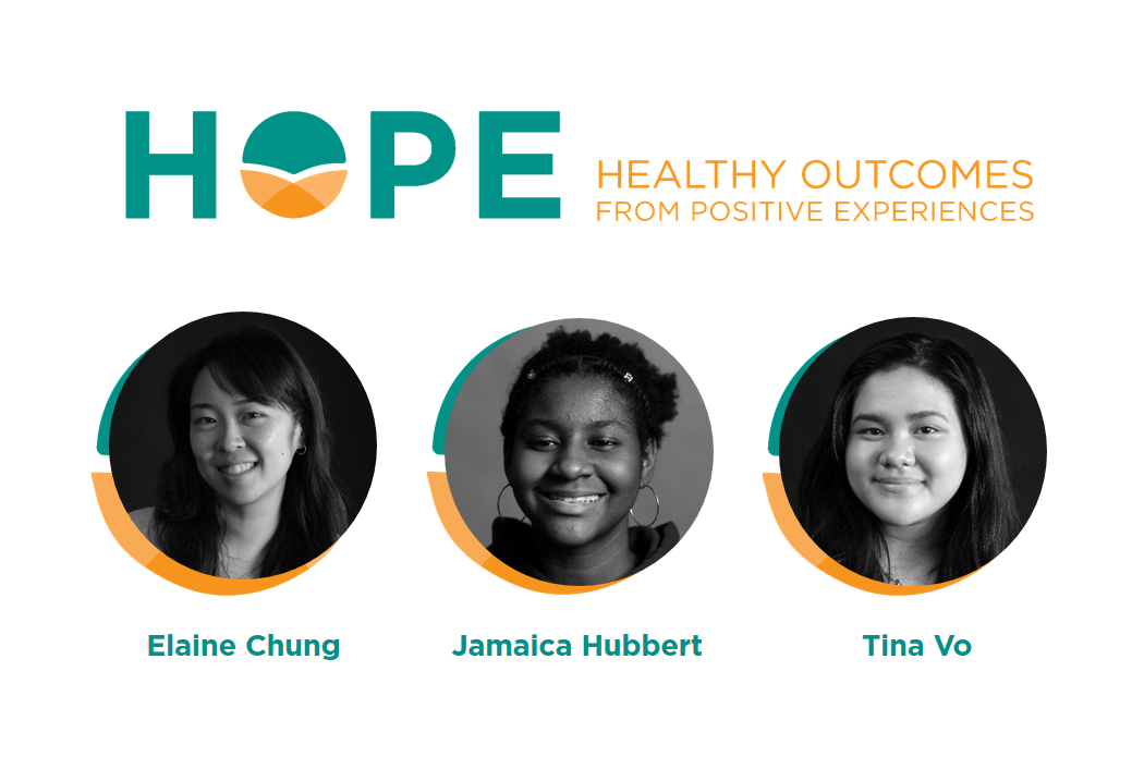
This week, we are launching our new HOPE logo, designed by a team of Boston graphic artists—who happen to be high schools students—and their mentor. Here is how our logo came to be:
Just before Covid-19 hit Boston, we HOPE team members found ourselves seated at a table with several teen artists. Taking notes as we spoke, these young designers asked us about HOPE and our desired imagery, collecting the information and preferences they needed to design our new logo.
These artists work for Artists For Humanity (AFH), a Boston nonprofit which “provides under-resourced teens the keys to self-sufficiency through paid employment in art and design” (from the AFH website). In past, teen artists and designers at AFH have designed the John Hancock building’s 60’x60’ wrap for the Boston Marathon, installed a 12’ sculpture of the Olympic torch for Liberty Mutual Insurance, replete with LED lighting, and designed and painted a 10’x45’ mural for the Massachusetts Port Authority. The HOPE team knew our budding logo was in good hands at AFH.
Three AFH artists continued to work with us even after their schools shut down: Jamaica, Tina, and Elaine Chung, their mentor. Every few weeks, the HOPE team met with these artists to provide input on the latest round of designs, along with Dan Zedek, former creative director of the Boston Globe, and social impact strategist Jabeen Yusuf of Health+ Studio, both of whom generously volunteered their time. Each week, the team was wow-ed by the designers’ talent, creativity, and hard work. Our discussions with them not only narrowed in on the final logo design, they also offered a space for us to verbalize and clarify what HOPE means to us.
Coincidentally, Elaine Chung, when she was an AFH teen herself, had helped design a logo for another project Bob Sege had led. She shared her thoughts on working to create the HOPE logo and offers insight regarding the symbolism: “It is always a great experience when Artists For Humanity and our teen participants are able to work on a logo project. Jamaica (age 15), came up with the idea of a light overcoming the darkness, and Tina (age 17), had the idea of a flower that represents healing. We were able to combine them and create a logo that best represents HOPE. One of the other aspects that is really important to our client was the four building blocks of positive experiences. We made sure that element was also included in their logo. With a lot of collaboration, not only with our teens but also with our clients, we were able to make sure to create a logo that touched all of HOPE’s branding and messaging.”
We are beyond excited by the result. A visual representation of HOPE, resilience, and positive health outcomes, with the four compartments of the “O”—representing the 4 Building Blocks—composing the healthy Outcomes of HOPE. The “O” is a symbol evocative of a flower, growing and healing, as well as a rising sun spreading warmth, a healing which pays it forward at multiple levels of support, from individual to community to ecosystem. Thank you, Elaine, Jamaica, and Tina, as well as Dan and Jabeen, for working with us to create a logo which so elegantly captures the essence of HOPE.
We love the logo so much, we are thinking of setting up a merch page! Let us know what you think and what you’d like to see there in the comment box below, or email us at hope@tuftsmedicalcenter.org.